Photos
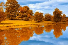
Autumn
Autumn by the lake is one of the prettiest times of the year

Golden Background
Sometimes a blurry background can look better
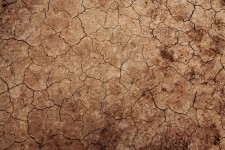
Cracked Earth Texture
If we don't get more rain, the ground might look like this
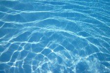
Pool Water Texture
This is refreshing looking
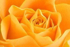
Rose
A rose by any other name -- how does the rest go?

Swan
The swan looks so peaceful
Below the images are specified with a style of width:100%, height:auto so the aspect ratio remains unchanged as the available space shrinks, and the image expands to fill the available space as the size of the viewport changes and medai queries get applied. The first image is also specified with a width=225 and height=150 and the second one isn't, so this seems to make no difference in the display size. If the swan image, which would normally appear in the second row, appears in the next row, this causes the previous image to display at a larger size so this would need be to addressed.
Autumn
Autumn by the lake is one of the prettiest times of the year
Golden Background
Sometimes a blurry background can look better
Cracked Earth Texture
If we don't get more rain, the ground might look like this
Pool Water Texture
This is refreshing looking
Rose
A rose by any other name -- how does the rest go?
Swan
The swan looks so peaceful
Below the images are specified with a style of max-width:100%, height:auto so the aspect ratio remains unchanged as the available space shrinks, but the image does not expand beyond its natural size to fill the available space as the size of the viewport changes and medai queries get applied. The first image is also specified with a width=225 and height=150 and the second one isn't, so this seems to make no difference in the display size. If the swan image, which would normally appear in the second row, appears in the next row, this causes the previous image to display at a larger size so this would need be to addressed.
Autumn
Autumn by the lake is one of the prettiest times of the year
Golden Background
Sometimes a blurry background can look better
Cracked Earth Texture
If we don't get more rain, the ground might look like this
Pool Water Texture
This is refreshing looking
Rose
A rose by any other name -- how does the rest go?
Swan
The swan looks so peaceful