TinkerPlots Dynamic Data Exploration Tool is a data analysis program designed specifically for students in grades 4-8. TinkerPlots was developed at the University of Massachusetts, Amherst, with a grant from the National Science Foundation. It is available for purchase from Key Curriculum Press at www.keypress.com/x5715.xml. The cost is $90 for a single user, but drops to $30/user for a 10-user lab package and $12/user for a 50 user school site/network license, or a total of $1000 for an unlimited user school site/network license. Instructors can download a 60 day free trial for evaluation purposes.
"What makes TinkerPlots different fromany other "graphing" or spreadsheet program is that, with TinkerPlots, students actually design their own graphs. This gives them a sense of being in control of what they produce." (TinkerPlots Dynamic Data Exploration Walkthrough Guide by Clifford Konold )
Like a word-processing or spreadsheet program, TinkerPlots is a general tool that can be used in a variety of subject matter areas. It comes with a variety of ready-to-analyze data sets drawn from a variety of topics.
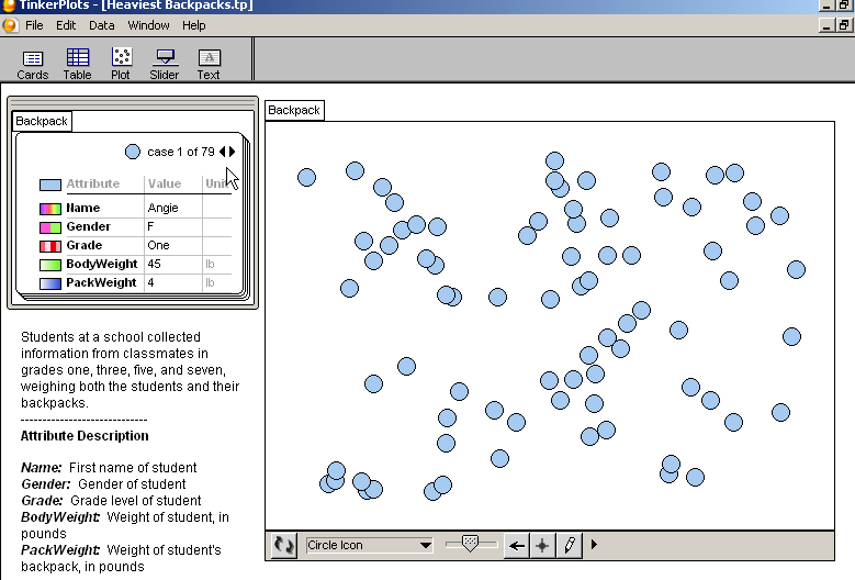
Choose File>Open and browse for the dataset which will have an extension .tp After the file is opened, you will see something like the following:
At the upper left, the first data card in the data set is displayed (case 1 of 79). The data card contains the data for a case. The data card displays the names of the various attributes for this data set and their units, and the value of those attributes for this particular case One can scroll through the data by clicking the arrows at the top right of the data card. To the left of the attribute names is the color scheme by which different values of the attribute will be represented in the circular dots in the plot to the right. For data with numeric values (many possible values), a gradient is shown where category data (a few possible values) is shown by a different color corresponding to each category.
The data in the plot at the right is displayed in random order. By clicking on an attribute in the data card, the data corresponding to that attribute will be shown in the plot on the right.
At the bottom of the plot, there are several icons - Mix Up (which arranges the icons in random order), a drop down list which controls the appearance of the icons, a horizontal slider which determines the size of the icons (this can also be determined by clicking on the arrow at the far right and selecting an icon size), a pencil icon which allows you to draw in the plot, and a "drag value tool" and an "add case tool".
There are three basic operations by which one can arrange case icons in the plot - stack, order, and separate. The buttons for these three actionsare located in the upper plot toolbar. To make these icons visible, you can click on the "add case tool" shown at the bottom of the plot.
Stack - Arranges case icons either vertically or horizontally . If there isn't enough room, multiple rows (horizontal stacking) or colums (vertical stacking) will be used. To reduce the use of multiple rows or columns, one can use smaller icons or make the plot window larger. By default, they are stacked in random order.
Order - To arrange the data icons by the values on a particular attribute, select the attribute in the data card and then in the Upper Plot toolbar click on the Order Vertical or Order Horizontal button. For vertical ordering, the name of the attribute will appear along the vertical axis, for horizontal ordering, along the horizontal axis.
Separate - This separates the cases in the plot according to their attribute values. When the groups are separated, TinkerPlots adds bin lines between the groups and labels along the axis as shown below.
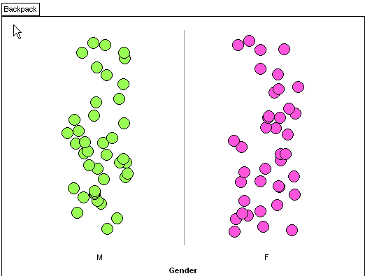
There are three ways to separate into groups:
If you want to plot the values of an attribute along the x or y axis, click on the attribute name in the data cards and drag it to the axis. If you want to eliminate the bin lines, drag a case icon to the right until the bin lines disappear. To remove an attribute from the vertical axis, click on the Separate Vertical icon; to remove an attribute from the horizontal axis, click on the Separate Horizontal button. If you have a category attribute displayed along an axis, the categories will be displayed in alphabetical order. To change this order, you can click on a particular category value and drag it.
You can also add various features to the plot by use of the icons at the top of the plot
It is often useful to have the analysis guided by questions you are trying to ask of the data.
Choose File>New and drag click on the Cards icon and drag it into the document. Choose Data>New Attribute to enter an attribute name - you then can enter a value and unit. Choose Data>New Attribute to add another attribute and so on. To enter data for a new case, just click on the arrow. (To save the data set, one would presumably chose File>Save but the Instructor evaluation addition does not allow you to save a data set).
If you want to see the data for more than one case while you are entering data, click on the Table icon and drag it into the document. You will then have a table where the columns refer to the attributes and each row corresponds to a case, similar to the layout one would have in Excel or in datasheet view in Access.
One can also easily import data directly from Excel. In Excel, the data needs to have the attribute names in the first row of the spreadsheet and each row below that will represent the data for a case for each of those attributes. In Excel, one selects all the data by clicking in the rectangle to the left of the A column heading and above the 1 row label), and selects Edit>Copy. In TinkerPlots, one clicks on the Cards icon to drag it into the document and then selects Edit>Paste Cases (Ctrl-V).
TinkerPlots can sometimes import data directly from the internet - choose File>Import from URL and paste in the URL of the page containing the data. This import process works particularly well from the DASL (pronounced "dazzle") data files at http://lib.stat.cmu.edu/DASL/
Revised: November 29, 2006. Comments to William Pegram, bill@billpegram.com