The following description is based on the DW tutorial found at https://helpx.adobe.com/dreamweaver/how-to/build-from-website-templates.html.
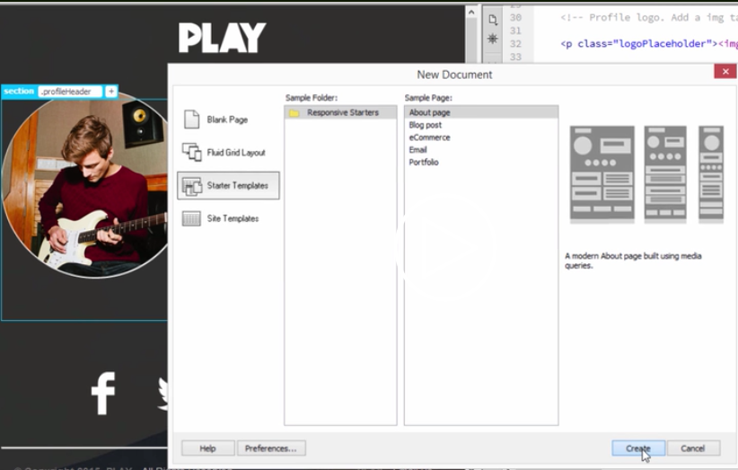
Dreamweaver Starter Templates are found in Dreamweaver CC 2014, 2015, and 2017. In CC2014, the choices are as shown in this screenshot

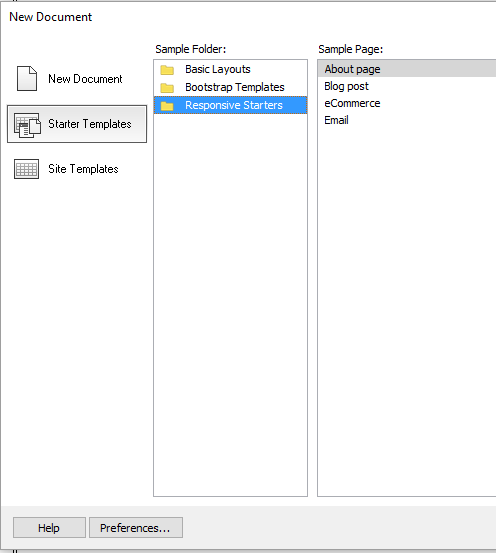
In CC2015, the choices are shown in the screenshot below:

The command for CC2014, 2015, 2017, and 2018 is File>New>Starter Templates>Responsive Starters. As you can see, the Portfolio choice in CC2014 has been eliminated in 2015, leaving four choices:: About page, Blog post, eCommerce, and Email. In 2017 and 2018, the Email choice is eliminated. Each is built with semantic HTML, in particular the new HTML5 tags of header, footer, section, article, and aside. By clicking on each one, you see a brief description and how it would look at three different screen resolutions, corresponding to phone, tablet, and desktop, using media queries.
Choose one and click Create and save the resulting file. In code view, you can see the structure of the page. Another way to see the structure of the web page is to use the DOM panel. In Live View, you can click on an element, and the icon on the left allows you to edit the HTML attributes and the plus sign on the right allows you to add a class or ID. If you do this in Split View, you can immediately see the changes in the code. If you look at the css file, the styles at the top define the foundation of the layout and the media queries near the bottom specify the changes that will occur at various screen resolutions - the first media query is for mobile, the second for tablet, and the third for desktop/laptop..
Choose File>Preview in Browser and see how the responsive design changes in response to the width of the screen. You can delete HTML blocks in the design if not needed and change the content either in Live/Design view or in Code view..
Revised: November 8, 2017